Alternate jerseys are awesome. There’s no disputing that. It’s one of the reasons the Oregon Ducks have a litany of jerseys in their repertoire.
Unfortunately, it looks like the 2017-18 will bring about the end of the most recent iteration of third jerseys, as the manufacturing of hockey sweaters will be moving from Reebok to Adidas next season. In order to make the transition as seamless as possible, the NHL has decided that teams will only have home and away jerseys, with the possibility of alternates coming back in subsequent years. The NHL has done this before, most recently in the 2007-08 when Reebok took control of manufacturing the league’s jerseys.
In the spirit of honoring some of the best designs, this post is dedicated to the best alternate jerseys of all-time. For those of you that are interested in my thoughts on the worst NHL alternate jerseys of all-time, you can check our my post here.
*Author’s note: realizing that my post from three years ago is still getting a lot of organic traffic, especially for the term *mooterus*, gave me the impetus to prepare this post.
Note that the following list is in alphabetical order. 19 may seem like an odd number, but after digging through team archives, there was a lot of consternation when it came to adding some potential jerseys to round the list out to 20, so you’re going to have to deal the odd number. Some teams were not featured due to a lack of an alternate that lasted more than a couple of games (Detroit, New Jersey, Montreal – despite the myriad of Centennial jerseys), or the third jerseys were simply too awful (sorry not sorry, Tampa Bay and Carolina).
Enjoy!
1. Anaheim Ducks Orange Alternate Jersey: 2015 to Present

For those of you that were fans of the old Mighty Ducks logo, this jersey is right up your alley. Not only does this add a sense of nostalgia for a rather young franchise, but blending the Ducks’ nascent primary with the colours of their current era turned out to be quite successful. In a league full of black, blue, and red jerseys, I’m rather fond of the Ducks’ decision to go with orange as the primary colour for their current alternate (author’s note: there are two other orange jerseys on this list).
2. Boston Bruins 2016 Winter Classic & Current Alternate Jersey: 2016 to Present

While this may be a homer vote considering my biased viewpoint towards anything Boston Bruins related, it’s hard to argue that this classic design isn’t among one of the best alternate jerseys in the NHL. While the design is rather simplistic, the classic look meshes well with the Bruins’ current home and away jerseys, and turns out to be a much better “men in black” jersey than the previous alternate.
3. Buffalo Sabres Classic Design Alternate Jersey (now their home jersey): 2008-2010

This may seem like an odd addition considering the image featured above shows Buffalo’s current home jersey, but it makes a spot on this list because it sparked the comeback of the Sabres’ original logo and uniform design. In 1996, Buffalo retired their classic look and replaced it with a new look that has been quickly forgotten. To make matters worse for the franchise, the team introduced the “Buffaslug” in 2006, so it was a breath of fresh air when this classic logo made it’s way back into the NHL.
4. Calgary Flames Throwback Jersey & Current Alternate: 2009-2013, 2016-Present

Although it was a bit premature due to the 2004-2005 lockout, the Calgary Flames decided to celebrate its 30th season in 2009 by introducing a throwback alternate inspired by the golden generation from the 80’s. This classic look added a nice touch to the Flames’ set of jerseys and was a marked departure from the flaming horse jerseys, which served them well before the lockout when gimmicky jerseys were the style, but has since become obsolete in recent years.
5. Chicago Blackhawks Winter Classic Jersey & Alternate: 2009-2011
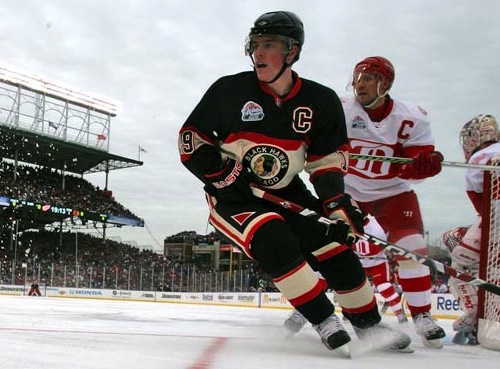
The Chicago Blackhawks introduced a vintage design for the Winter Classic game against its heated rival at the time, the Detroit Red Wings (thanks, NHL realignment, for ruining this awesome rivalry). The jersey has been kept as an alternate ever since due to the praise it received from Blackhawks fans and NHL spectators alike. Unfortunately, this jersey was dropped from the regular rotation starting in the 2011-12 season. If you’re a fan of black Blackhawks jerseys though, this next entry will be right up your alley.
6. Chicago Blackhawks Alternate Jersey: 1996-2007 & 2008-2009

In an era rife with awful third jerseys, the Chicago Blackhawks went a different route and used the same design as their home and away set, but changed the main color to black. While they did not deviate from their main set of jerseys, the clean look added a nice touch to their repertoire, quickly becoming a fan favorite around the league. While this jersey has since been retired and replaced with the classic jersey referenced above, it lasted for over 10 years, having a longer shelf life than most (if not, all) alternate jerseys.
7. Colorado Avalanche Current Alternate Jersey: 2015-Present

While the Avalanche weren’t directly paying tribute to the original Colorado Rockies franchise, the main crest bears a striking resemblance to the vintage jerseys from the first professional hockey team in Colorado. This jersey added a sleek and classic look to an otherwise young franchise, which was refreshing considering the baby blue jerseys were met with consternation.
8. Columbus Blue Jackets Current Alternate Jersey: 2010-Present

Although the Pittsburgh Penguins started the trend of blue jerseys with a round crest, the Columbus Blue Jackets took it up a notch with this beauty. Rather than relying on gimmicks such as a green yellow jacket (apologies to those of you that are a fan of Stinger), the Blue Jackets opted for a more professional look with a logo that reflects the team name, referencing Ohio’s contributions to the American Civil War.
9. Edmonton Oilers Current Alternate Jersey: 2015-Present

As you can glean from this list, throwback jerseys and classic designs get preferential treatment to some of the more experimental designs. In this case, I decided to list Edmonton’s throwback jerseys over the unique design from Todd McFarlane. While that particular jersey served the Oilers well before the 2004-2005 lockout, fans were ecstatic to see the orange jerseys from the WHA era make an appearance again in Edmonton. If you’re a fan of this jersey, you’ll be glad to know that the Oilers have announced the orange jersey will be kept as the home kit next season, with the current home jersey being dropped from the regular rotation.
10. Los Angeles Throwback Jersey: 2014-Present

Although the Los Angeles Kings have used a myriad of alternate jerseys throughout its history, including the infamous Burger King jersey, this classic throwback ranks highly within the Kings’ repertoire. While the current third jersey is slick, the gold and forum blue classic jersey has earned a spot on this list because it represents the first iteration of the Los Angeles Kings’ colours prior to the switch to silver & black.
11. Minnesota Wild Current Alternate Jersey: 2009-Present
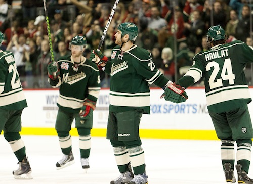
The Minnesota Wild’s current alternate jerseys feature an all-green uniform, something that is quite rare in the NHL. While the Wild’s red Christmas jersey started off as an alternate and eventually became its home jersey, this particular alternate had a more distinct feel to it within the league. Also, while most word mark logos feel uninspired, the team name feels natural with this jersey, making it a worthy inclusion on this list.
12. New York Rangers Heritage & Current Alternate Jersey: 2010-Present

When it comes to the New York Rangers, deviating from the norm is something that rarely happens. While the current alternate jersey features a darker shade of blue as the dominant colour, it blends well with the current home and away set. The Statue of Liberty jersey almost made this list, but the ineptitude of the Rangers prior to the lockout taints an otherwise creative jersey. Additionally, the gimmicky style of alternate jerseys prior to the lockout has not aged well, which is why this current alternate made the list.
13. Ottawa Senators Current Alternate Jersey: 2011-Present

The Ottawa Senators have not always been fortunate when it comes to designing alternate jerseys, as exhibited by the SENS jersey that was mocked and ridiculed worldwide (hyperbole for effect). However, this throwback style uniform pays homage \to the original Ottawa Senators franchise, adding a historic element to a franchise that is officially younger than I am.
14. Philadelphia Flyers Winter Classic & Alternate Jersey: 2014-2016

While this particular jersey didn’t have a long shelf life, the Philadelphia Flyers’ Winter Classic jersey proved to be a raving success, quickly becoming an alternate jersey for the team in subsequent seasons. Although it did not stay in the regular rotation for more than a couple of years, the vintage touch to an already classic look gave the Flyers a fresh kit.
15. Pittsburgh Penguins Former Alternate & Current Home Jersey: 2014-2016 (Alternate) & 2016-Present (Current Home)

Once again, the classic look for an alternate jersey proved to be successful, as the Pittsburgh Penguins quickly made the jersey displayed above the new home jersey for this current season. However, the Penguins have had a number of impressive third jersey designs, including the baby blue throwback design used for the inaugural Winter Classic. That said, this jersey earns a spot on this list because it forced the franchise to go back to the colours donned by Lemieux and company during the Penguins’ golden years in the 80s and early 90s.
16. San Jose Sharks Current Alternate Jersey: 2008-Present

The San Jose Sharks franchise has always had an affinity for all-black alternate jerseys, which is why it came to no one’s surprise that the Sharks brought the intimidating look back after the 2004-2005 lockout. Rather than opting for a colourful scheme, the Sharks kept it simple, which added a nice edge to the team’s jersey collection.
16. St. Louis Blues Alternate Jersey: 2008-2016

By far my favorite entry on the list, it saddens me that the jersey featured above is no long in Use by the St. Louis Blues. While the trend of blue jerseys with a logo crest reached its zenith in 2010, the St. Louis Blues added a sleek and modern design to its classic jersey set. Not only does this jersey really stand out on the ice and gives the team an edge, the usage of the Gateway Arch was a nice touch to pay respect to the city of St. Louis.
17. Toronto Maple Leafs Alternate Jersey: 2000-2011

While the Toronto Maple Leafs may have adjusted their primary logo for the foreseeable future (how can you ditch the new logo after finally making the playoffs in an 82-game season), the vintage Maple Leaf was only present via an alternate jersey during the 2000s. There’s not much to complain about with this jersey. Despite the simplistic design, it brought back a much superior logo to the Leafs’ jersey set.
18. Vancouver Canucks Alternate Jersey: 2008-Present
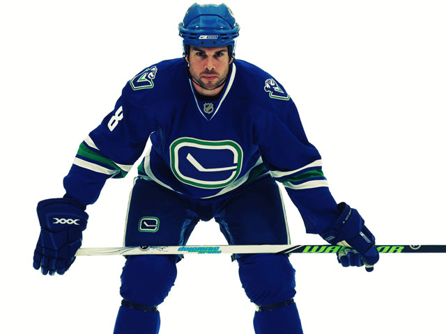
My personal feelings aside as a Bruins fan (even though it was six years ago, the 2011 Stanley Cup Final was a bloodbath), one cannot argue with the inclusion of the Canucks’ current alternate jersey on this list. While the hockey stick logo may be a little too simplistic for a jersey, the green and blue colour combination work perfectly with this vintage logo, blending in nicely with Vancouver’s current home and away jerseys. Long gone are the nightmares of gradients and horrific jerseys.
19. Washington Capitals Alternate Jersey: 2015-Present
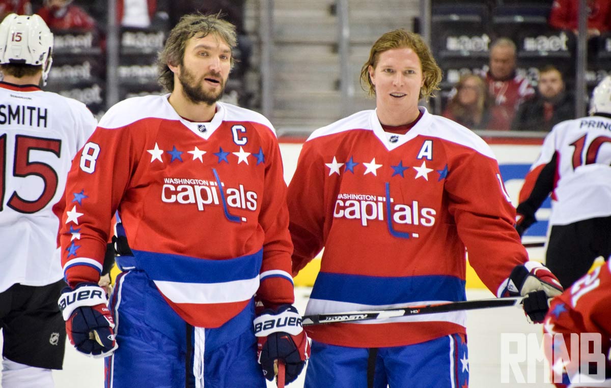
As the current list illustrates, yours truly has a penchant for admiring vintage jerseys. With regards to the Washington Capitals, one cannot help but like the vintage kit the Capitals brought back in 2015. While the Capitals did bring back a modern version of their original logo after the 2004-2005 lockout, this alternate stands alone by using the original logo’s font with stars on the chest and arms. Of course, I would not complain if the Capitals did bring back the bald eagle in the future, but I digress…
While this list isn’t comprehensive and highly subjective, it does provide a representative sample of both vintage and experimental designs, all of which have been met with adoration from each respective fan base. It will be a shame to have no alternate jerseys next season, but in the following years, you can bet that new lists will pop up critiquing and praising some of the designs to come.
