A Collection of Some of the Worst NHL Alternate Jerseys in History
After the recent St. Louis-Buffalo trade that saw Miller and Ott travel west, I immediately thought that both players were fortunate to never have to wear the monstrosity that is Buffalo’s third jersey ever again. This got me thinking about some of the worst third jerseys to ever grace the ice in the NHL, so...
March 3, 2014
Updated July 6, 2020
7 min read
Jonathan Berthold
After the recent St. Louis-Buffalo trade that saw Miller and Ott travel west, I immediately thought that both players were fortunate to never have to wear the monstrosity that is Buffalo’s third jersey ever again. This got me thinking about some of the worst third jerseys to ever grace the ice in the NHL, so I came up with a collection of some of my favourites (or least favourites?) below.
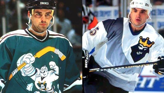
1. Mighty Ducks of Anaheim – 1995/96
Source: Sports Logos
The 90’s Mighty Ducks were a fun team to watch with Kariya and Selanne up front, but this jersey was scarier than any goon that laced up skates…and not in a good way.
2. Boston Bruins – 1995/96 to 2005/06
The Winnie the Pooh jersey makes this list because it portrayed the “Big Bad Bruins” as tame teddy bears. I am ashamed to admit that I own a replica version of this jersey.
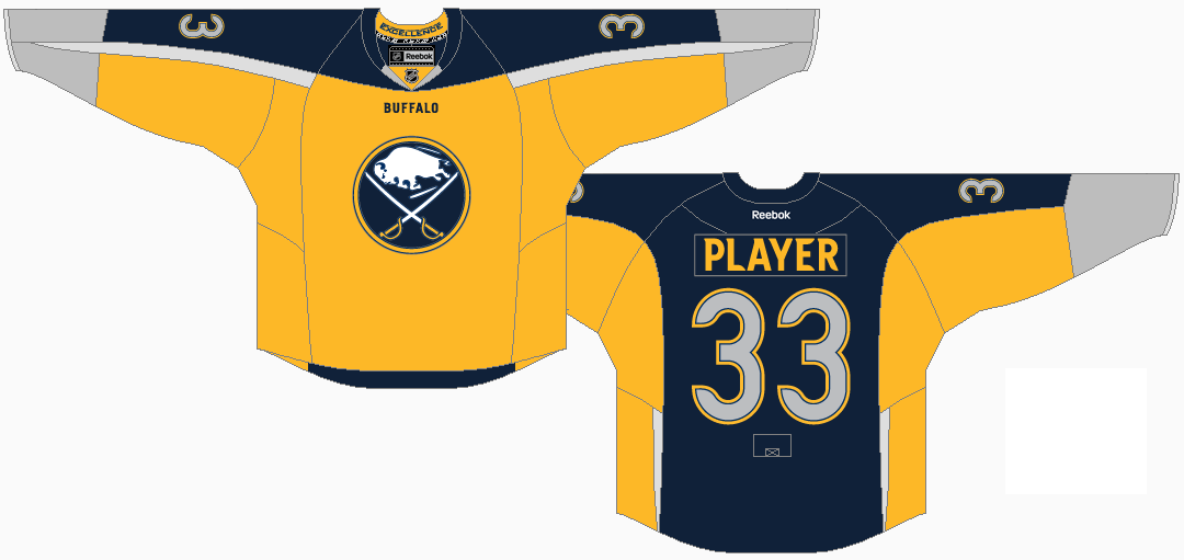
3. Buffalo Sabres – 2013/14 to Present
Source: CBS Sports
Buffalo is notorious for terrible jerseys (at least the Buffaslug horror is long gone) and this third jersey has to top the list of franchise disasters. The colour scheme is just terrible and the addition of a small word mark above the logo is absurd.
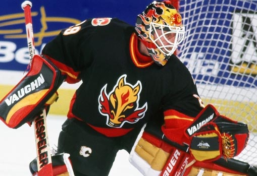
4. Calgary Flames – 1998/99 to 2005/06
Source: Sports Logos
A horse that breathes fire out of its nose…if that doesn’t say flames, nothing will!
5. Dallas Stars – 2003/04 to 2005/06
Source: The Score
Nicknamed the “mooterus jersey”, this Dallas Stars alternate provided many NHL fans with a good laugh or two and younger fans with an introduction to female biology.
6. Los Angeles Kings – 1995-96
Credit: The Royal Half
Burger King couldn’t have asked for a better advertising placement in sports without spending a dollar. Ceremonial faceoff? Nah, we’ll have a ceremonial Whopper instead.
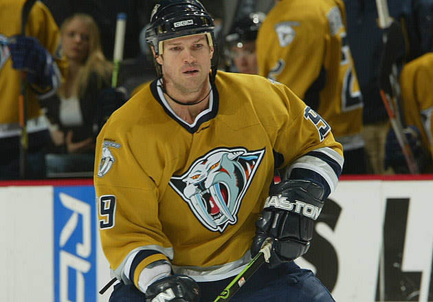
7. Nashville Predators – 2001/02 to 2006/07
Source: Smell the Glove
Although the current Nashville yellow uniforms are sharp, this mustard yellow alternate looks like it came from the ice age.
8. New York Islanders – 1995/96 to 1996/97
Source: Sports Jerseypedia
While not an official third jersey, the Islanders slowly went away from this set by replacing the fisherman’s logo with the traditional Long Island logo and rotated two sets of Home/Road jerseys in 1996/97.
9. New York Islanders – 2011/12 to 2013/14
Source: New York Sports Hub.
The Islanders make the list again with this dull and uninspired alternate, resembling the New York Mets on ice.
One of two jerseys on this list to use a nickname for a word mark, which is just a terrible use of a jersey. I also caught myself thinking the jersey said “SNES”.
11. Phoenix Coyotes – 1998/99 to 2002/03
I was one of the few fans of the old Phoenix Coyotes logo, but this was just an unmitigated disaster and a terrible design for a professional hockey jersey.
12. Tampa Bay Lightning – 1996/97 to 1998/99
In case you didn’t know what the word “lightning” meant, Tampa Bay made sure to design lightning bolts all over the jersey, including the sleeve.
13. Tampa Bay Lightning – 2008/09 to Present
Source: The Checking Line
Instead of designing lightning bolts, they just decided to write BOLTS this time around. Even worse.
14. Vancouver Canucks – 2001/02 to 2005/06
Source: The Score
Vancouver is another franchise that has a plethora of terrible jerseys, but this makes this list as it was a needless alternate. Honestly, why use a gradient when just red would have been a cooler option?
15. St. Louis Blues – Never Worn
Source: Photobucket user Spyboy1
Although this jersey was never worn, it deserves to make the list for being designed in the first place. St. Louis should have worn these jerseys because other teams would have just surrendered from not being able to stop laughing all game long.
Alternate jerseys are awesome. There’s no disputing that. It’s one of the reasons the Oregon Ducks have a litany of jerseys in their repertoire. Unfortunately, it looks like the 2017-18 will bring about the end of the most recent iteration of third jerseys, as the manufacturing of hockey sweaters will be moving from Reebok to...